
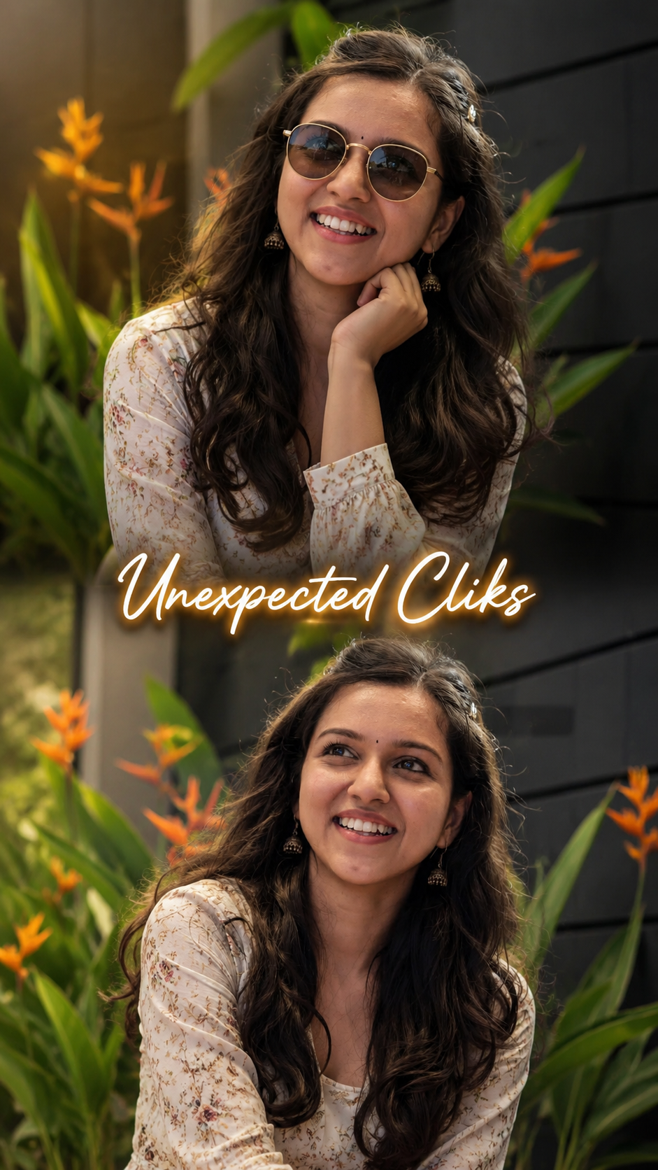
Double Exposure Style Photo Editing
Double exposure is that dreamy, layered look where two images blend into one. Think silhouette filled with a forest, or a portrait mixed with city lights. Here’s your blog content broken into 3 parts you can post as-is or expand.
Part 1: What Is Double Exposure & Why It Works
- Definition: Double exposure started on film cameras when you snapped two photos on the same frame. Now we recreate it digitally by blending two images with masks and blend modes.
- Why it’s popular: It tells two stories at once. A person + nature = connection. A face + skyline = ambition. It’s instant emotion and symbolism.
- Best image combos:
- Portrait + Texture: Silhouette + trees, clouds, water, or smoke
- Object + Scene: Coffee cup + cozy café, guitar + concert crowd
- Contrast themes: Human + architecture, calm face + stormy sea
- Pro tip: Use high-contrast silhouettes for your base image. White background, dark subject makes masking 10x easier.
Part 2: How to Create Double Exposure in 5 Steps
You can do this in Photoshop, Canva, PicsArt, or even Snapseed. Here’s the Photoshop version:
- Pick your base image: Choose a clean side-profile or backlit portrait. Cut out the subject if needed.
- Add your second image: Place the texture/landscape over the portrait. Scale it to cover the main area of the subject.
- Change blend mode: Set the top layer to
Screen,Lighten, orOverlay.Screenworks best for dark portraits. - Mask it out: Add a layer mask to the texture layer. Use a soft black brush to hide parts you don’t want, keeping the blend mostly inside the silhouette.
- Adjust & unify: Lower opacity to 70-90%. Add a gradient map or color grade so both images share the same tone. Slight grain sells the film look.
Phone apps shortcut: PicsArt → Add Photo → Blend → Lighten. Snapseed → Double Exposure tool → pick image → use brush to erase.
Part 3: Creative Ideas + Common Mistakes to Avoid
- Creative ideas to try:
- Seasonal mood: Portrait + autumn leaves for fall vibes, + ocean waves for summer
- Storytelling: Musician + sound waves, traveler + map texture
- Color theme: Keep both images in the same color family. Blue portrait + blue city = cohesive
- Common mistakes:
- Too busy: If both images are detailed, it turns into chaos. One should be simple.
- Bad contrast: Gray-on-gray doesn’t pop. You need light + dark playing together.
- No focal point: The eye needs somewhere to land. Make sure the face/eyes are still clear.
- Final polish: Add subtle vignette and dust overlays. Export in high res. Instagram loves 1080x1350px vertical.
Want me to turn this into a carousel caption series too, or give you Lightroom preset tips for the color grading?
👇✅ Prompt ✅👇
Prompt (9:16 Ratio | Same Style | Middle Text “Unexpected Cliks”)
Ultra-realistic DSLR portrait photography, vertical 9:16 ratio (2304×4096), 8K UHD, premium cinematic quality, same composition and framing as the reference image, split-frame layout with two identical portraits of the same girl (top and bottom), lush tropical garden background with green foliage and orange bird-of-paradise flowers, dark modern wall backdrop, soft natural daylight, creamy bokeh, shallow depth of field (f/1.8), realistic skin texture, natural black shoulder-length hair, elegant white floral printed long-sleeve dress, calm smiling expression, premium color grading, HDR, ultra-sharp focus on the subject, professional portrait photography, minimal aesthetic, clean composition. In the exact center between the two images, add the stylish text “Unexpected Cliks” in a modern luxury handwritten script font, white lettering with a soft golden glow, subtle 3D emboss effect, elegant drop shadow, premium logo-style typography, perfectly centered, crisp edges, cinematic branding look, high-end Instagram photography aesthetic, no watermark, no extra text, ultra-detailed, photorealistic. Plx Creat the image Both pics Not Same 2Pics 2 diffrent style